
Website redesign mistakes: How to avoid them, how to work through them, and how to design something sustainable
, Alysse Bortolotto, Fords Theatre Society, USA, Desi Gonzalez, The Andy Warhol Museum, USA, Jessica Warchall, Terra Foundation for American Art, USA, Michael Tedeschi, Interactive Mechanics, USA, Curt Kotula, FASTSPOT, USA
Abstract
Are you thinking about or in the process of updating your website? Website redesign is not just about changing the look of your website. This panel will explore lessons learned and give strategies to overcome the mental hurdle that comes with a project of this size. Regardless of the type of institution and the purpose the new website will serve, all organizations face similar challenges when embarking on this process and all fall prey to common mistakes that can be avoided to create a living and sustainable website. Panelists from Ford’s Theatre, The Andy Warhol Museum, and Interactive Mechanics share their experience in planning and executing a sustainable website redesign. Both museums offer a unique perspective with different purposes, audiences, and stories. As a large tourist destination welcoming over 650,000 visitors a year, the Ford's Theatre website must convey the multiple identities of being a working theatre, museum, historic site, and education center. While The Warhol's first redesign phase focuses on visitors planning a trip to the museum, we’re thinking about how to develop a platform that allows for future development and transforms warhol.org into an authority and destination for information about Andy Warhol.Keywords: website redesign, sustainability, content strategy, service design, digital, process
Introduction
In Abraham Lincoln’s first inaugural address, he is famously quoted as saying, “nothing valuable can be lost by taking time,” and his words could not be more felicitous for a website redesign process. With the support of our board and with the strategic vision set forth in an institutional long-range plan and five-year digital strategy, Ford’s Theatre is taking steps to broaden its impact through digitally supported initiatives. Our first step in our digital evolution was developing a new, sustainable, mission-driven website, with an integrated ticketing and donation system that ensures our online customer experience complements our world-class on-site experience. With the understanding that many institutions have far more shared challenges than unique ones when they approach a website redesign project, we hope to share our experiences, perspective and lessons learned to help inform and support other institutions in their efforts to expand their digital reach and web presence.
Strategic digital approach
It is hard to speak about our new website without tipping our hats to a five-year digital strategy developed in partnership with the digital firm Threespot, which has served as an integral part in identifying challenges and prioritizing solutions faced by the institution.
In the fall of 2014, with the collaborative efforts of a cross-departmental team and our consultant, Threespot, we began crafting a digital roadmap focused around institutional and user goals, which identified a website redesign and a new ticketing/donation system as top priorities. As Carousel30 (Kihlström, 2012) points out in the white paper “Creating a Digital Strategy for Nonprofits,” “tying your goals (organizational or audience- driven), content and metrics back to results that are easy to define as successful or not” provides a clear vision forward and circumvents common mistakes based on assumptions.
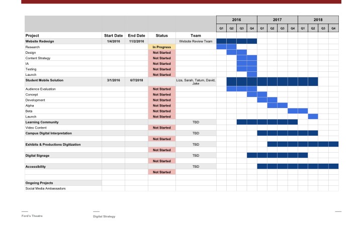
An analysis of our digital position at the time identified key challenges facing our organization, such as website visitors’ frustration around understanding the on-site experience, staffing limitations, disjointed digital efforts across departments, and inconsistent visitor data collection. Threespot organized a holistic and data-driven digital strategy, including eight comprehensive digital initiatives designed to address the key challenges, which would put us on the path to becoming a digitally adapted institution.
Website vendor selection
Beginning with the task to improve our online visitor experience, we started by selecting a website vendor. Based on peer institution recommendations, previous website awards and strong portfolios, including work for cultural institutions, we assembled a list of 21 possible website vendors. Fifteen of those submitted proposals, which we narrowed down to three finalists. Because the Ford’s team highly values collaboration, proximity to Ford’s Theatre was an important factor when we selected the finalists. The finalists were invited to Ford’s Theatre for in-person presentations. We strongly recommend in-person interviews or presentations prior to making a final selection. The in-person meetings gave our team the chance to ask deeper questions, better understand the vendor’s process and vision, and find chemistry in the team with whom we would be working.
When preparing your request for proposals (RFP), consider the types of information vendors will need to be able to prepare an accurate bid. Include information about challenges faced with your current website, goals of the new site, existing and aspirational audiences, budget, timeline, and individuals involved. Be upfront by acknowledging areas of uncertainty or where you’re looking for extra support, and ensure your team agrees on this document. Give your vendors adequate time to review, ask questions, and prepare their response.
How we chose the vendor
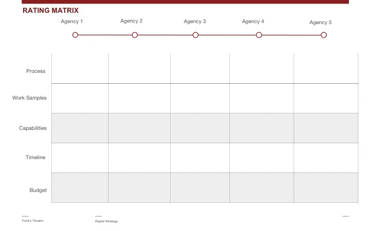
Each submitted proposal was evaluated using a rating matrix. We requested information of each vendor concerning the project timeline, budget, project team, staff capabilities, and case studies. Additionally, we evaluated how they planned to creatively approach the project. The rating matrix, which we have provided as a resource in the Appendix [1.1], helped our team objectively eliminate vendors and have a focused discussion on the highest-ranking vendors.
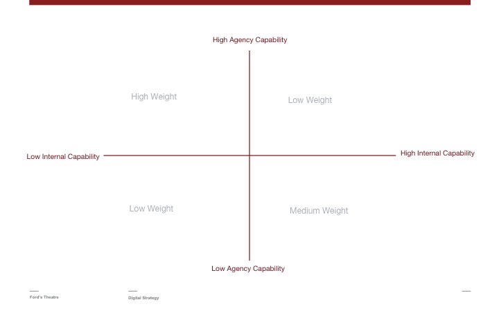
If your internal team is struggling with a final decision, another method to evaluate vendors is a Kano Model Analysis. Taking inspiration from this model, we plotted our website needs on a graph with our internal capabilities on the x-axis and the vendor’s’ strengths on the y-axis. This exercise visualized weighted needs to determine the best-suited vendor. We have included in Appendix [1.2] a template that can be adapted for your institution.
Redesign process: In four Acts
In November 2015, on-site kickoff and discovery meetings began with Fastspot, our chosen agency. Fastspot is a talented and highly visionary Baltimore, Maryland-based firm. Together, we began the 13-month website redesign project with a launch date of December 6, 2016. Their discovery process included the following:
- stakeholder meetings;
- an audit of our technologies;
- an evaluation of previous research and collected data;
- on-site observation and research.
Coming down from the excitement of the project kickoff, now armed with a master calendar and with highly anticipated deliverables looming, we were ready to take off running. Ford’s Theatre’s internal project manager worked with a cross-departmental core team to keep the project momentum moving forward and creating early buy-in from across the institution, throughout the project. Taking a proactive approach, our internal departments worked with Fastspot to start crafting user stories, journey mapping, and creating an interpretive online plan that helped to frame the new website and future initiatives.
Here’s the way we organized this process:
- Develop a unified vision
- Prioritized audiences
- Create audience personas and craft user stories
- Used user stories to create journey maps
- Refine content and nomenclature
- Focus on sustainability
Unifying a vision
Author Patrick Lencioni (2006) states that silos “waste resources, kill productivity, and jeopardize the achievement of goals.” Prior to beginning this project, our leadership understood that for our organization to truly make large and lasting digital advancements, we had to work towards a common goal, from the top down. From our perspective, after having a dedicated executive board committee and an internal cross-departmental team invested in our digital strategic process from the beginning, we have discovered it accomplished following:
- provided us with a unified vision;
- ensured early support from key stakeholders;
- broke down departmental silos;
- promoted a more collaborative, streamlined digital forward-thinking process to all aspects of our work.
Breaking down internal department silos not only improved how we approached digital projects, but also how we communicated our work to online audiences. Being able to reimagine the content and structure of our new website outside of traditional silos and with collaborative input resulted in a more user-focused approach and improved our working experience.
Act one: Understanding the user
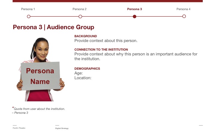
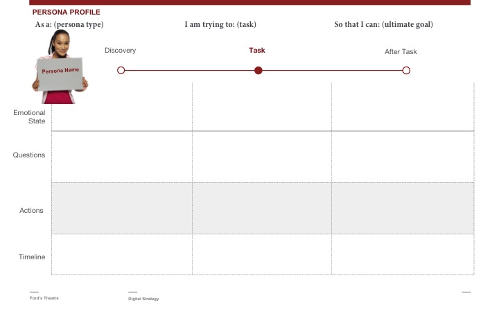
The first step in user-centered design truly understands your current and aspirational users. We used a combination of surveys, interviews, analytics and demographical data to better understand our user’s motivations, expectations and needs. The gathered data would inform the personas, user stories, and journey maps. If taking this task on internally, user personas and story templates provided in Appendix [2.1] can be a great place to start the conversation.
Fastspot provided our team with audience personas and user journey maps for select audiences, which aided our team in imagining the different ways users may be introduced to our content. This allowed us to identify touch points and opportunities to engage each audience as they completed a specific task or engaged with our online content. Using customer journey mapping templates, provided in Appendix [2.2], our team thought through the following:
- various tasks customers needed to complete;
- questions they may need answered while completing tasks;
- where they learned about the institution and/or task;
- and what the user is feeling at this stage in the process.
Having the user in mind while answering these questions kept our team focused on user needs and not solely departmental objectives. An example of how defining audiences informed online interpretation is our decision to restructure our history-based content. We decided to begin the story where our users were beginning the story: the assassination. We found people were landing on our site after searching about the Lincoln assassination. We restructured our content to begin with the assassination and then explore deeper topics revolving around that moment. Telling the historic story in a non-linear format meant adding complexity when creating content for a native Web format. The new approach to storytelling and defining our place in the story forced an internal mind shift for our organization, which has had a lasting impact for our on-site interpretation.
Prioritizing
Content should be at the heart of the redesign process. Taking time to understand our visitor types and their motivations informed many decisions on how the website should be built from the architecture, to the functionality and layout. With hindsight, it’s apparent that developing a flexible, clear idea of our interpretive goals, content and customer journey was one of the most essential parts of this process. Ford’s knew we needed to approach the architecture, functionality and content drastically differently from our previous website, and in retrospect, we think conducting content workshops earlier in the process would have instilled a greater sense of confidence in our team.
Primary, secondary, and tertiary audiences
A unique opportunity and challenge we faced was how to introduce users to our multiple identities—as a working theatre, museum and education center—in an organic and user-focused way. As a theatre and historic landmark, we had a lot of user data, but internal competing audience priorities. After creating six user personas, it was difficult for our team to agree on which to prioritize. Prioritization is important for deciding your content and architecture.
It can be a challenge to narrow down audience focus, especially when you have multiple identities and audiences to serve. Our team, with the guidance of Fastspot, made the tough decision to prioritize audiences into primary, secondary, and tertiary segments. Having an expert consultant provided an objective perspective that was essential to pulling internal stakeholders away from preconceptions.
Information architecture
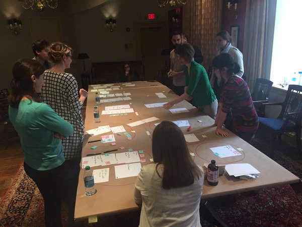
Our organization struggled with not giving equal weight and priority to content in the navigational structure and content features on the homepage and throughout the website. Going back to the user stories, Fastspot facilitated an in-person information architecture workshop with our team using card sorting of essential information.
Card sorting can also be a powerful tool to help identify confusing language and give your users a voice in organizing the website in a way that makes sense to them.
As an institution that strives to bring its content into classrooms, we spent a considerable amount of time working with teachers to understand their behaviors, needs and expectations when adapting resources for their classrooms. By focusing on tasks and user behavior of our teachers, we simplified the paths and provided a more fluid user experience than our old site. For example, our educator audience exists within a highly social community of other educators, and they tend to be self-aware. They are a task-oriented visitor either trying to find resources, educate themselves on the history, or get ideas for classroom activities. Understanding this user type led us to create an architecture that gives teachers a one-stop shop for all their formal education needs. This is an important distinction in relation to our decisions around the casual learner. In addition, we created social opportunities for them to share resources with their networks. In recognizing that not all teachers are looking for a canned lesson plan and some are seeking an opportunity to build their own, we added functionality that allows the educator to collect resources and save items for later.
TIP: Personas are fluid. Understand that a person can move between personas without even thinking about it. Personas may change with each session they have with your site. User stories help keep you grounded.
Handling Internal competing interests
Every website team struggles with decisions around what to put on the homepage. The homepage is considered the most valuable page on the website and every department wants their content featured here. A homepage content dump ends up screaming a lot of mixed messages at the user. So how do you prioritize content you would like the user to pay attention to while balancing institutional goals and appeasing stakeholders? To avoid content pollution and user confusion, the website needs defined purposes in what texpected action and/or information is being conveyed. Ask the question “is this an appropriate time for the user to be presented this information?” To achieve this you should prioritize “elements that [you] want users to pay more attention to” (Boag, 2012). To facilitate conversations around prioritizing content, we focused our team on creating journey maps and constantly looked back to our user stories. For additional examples and tips on journey mapping, read author Paul Boag’s (2015) blog entry, “How to Run a Customer Journey Mapping Workshop.”
As part of the discovery process for the Eastern State Penitentiary website redesign, Interactive Mechanics worked with each of the different departments in the organization to understand their individual needs and better understand the current and aspirational content for the new site. This allowed the team to have a complete picture of the types of content that internal stakeholders hoped to see in the new site. This was later compared to existing research, current site analytics, and user testing with audiences on-site.
Consistency and nomenclature
Writing for the Web is a challenge, and finding the proper nomenclature that is clear for users can often feel unnatural. When defining nomenclature, it is important to start with the audience personas. Each navigation item, title and call to action needs to resonate with the user, and be easily searchable online while bearing in mind the age, education level and audience being spoken to. To assist with internal disagreements or avoid making assumptions, we advise using tools such a Google Trends and Google Optimize, as well as looking at internal and external search queries to your site. We also recommend you send a survey to users, or conduct in-person A/B testing to find the terms that best resonate with your audience. Try to stay away from jargon, (which can be hard to do), by having an outsider review online copy to ensure it is easily understood. When our team arrived at hurdles, we sent out surveys and/or directly spoke to on-site visitors to help us finalize language.
Standardizing language used both on the website, print materials, social media, and at your physical site instills confidence in the user’s choices and creates a more cohesive brand. The nomenclature changes that resulted from the website had to be instituted on our visitor historic site tickets, e-mails, digital signage, and other public messaging. In addition to standardizing our language through our physical site and online, we also developed standard formatting for different content items and sections of our website that have been useful in how we collect and organize new content. Users appreciate knowing what to expect and having a consistent formula for how the information is being delivered to them.
TIP: Avoid internal jargon. If you’re wondering if it is jargon, look on other websites, send out a quick survey with a few options, or test the language through user testing.
Conducting user testing
There are plenty of opportunities throughout any digital design project to gather valuable visitor feedback. Plan these testing sessions into your project at different phases to validate your content and design decisions, survey user preferences, or find usability problems. During the redesign for Eastern State Penitentiary, Interactive Mechanics conducted testing sessions at various points in the process: preliminary information architecture, design prototypes, and the beta review of the website. For additional information on planning and conducting usability testing sessions, explore additional resources on Usability.gov (Running a Usability Test, n.d.).
Act two: Sustainability
You are ambitious, which, within reasonable bounds, does good rather than harm. —Abraham Lincoln to Joseph Hooker, 1863
When approaching this process, we had to constantly temper our ambitions with sustainable solutions to ensure the health and success of our new website. From the beginning of this process, we developed key performance indicators (KPIs) to define realistic expectations and understand what success looks like for us. Additionally, the new website will be audited quarterly and bi-annually to ensure we are meeting our KPIs. User testing and retesting will continue to be part of our process in making improvements to the website. Setting aside time to analyze the results and strategize changes prevents knee-jerk solutions and guides smart, informed decisions around enhancing the website.
Management
Successful websites need to be constantly managed and continually improved. As part of the digital strategy, Ford’s made a commitment to embed digital skills into all of the staff by training departments in becoming website content creators. We plan to create training materials and run workshops to set expectations, establish guidelines and teach skills needed to maintain the website and ensure the integrity of its content. In addition to using the content strategy, voice and tone guide provided by Fastspot, we have developed a content schedule, created a digital projects template to ensure all new projects align with our institutional goals, and continued to journey map new content focused around user stories. As part of this redesign, we also budgeted for upgrades that would allow the site to grow with our organization’s digital initiatives and the ever-evolving digital landscape.
In addition to understanding the ongoing content requirements, Interactive Mechanics worked with Eastern State Penitentiary to create an annual maintenance plan. This schedule tracks website updates, renewals, and other non-automated tasks to help ensure the site runs smoothly in the future and keep the internal team accountable for ongoing maintenance.
Content distribution
Lessons learned from past initiatives led us to take a different approach to educational content. We decided to pursue partnerships with other educational platforms and websites to share our content outward. Our teacher audiences were already looking for resources on other platforms; by having a presence on these other educational platforms, we can increase access to our content. As a nonprofit, we are not in competition with others over content. Our objective is to be the reputable source for Lincoln’s assassination and legacy and provide the best resource for teachers in the most findable way. In this case, the user is likely to start trying to find rich content by first starting at Google, not necessarily coming directly to your website even if you are the reputable source. We made an institutional decision to have a presence where the user would be going to learn. Sometimes our content is our emphasis rather than getting the user to our actual website. Developing relationships with other learning platforms will help us leverage our content and increase the usage of our learning materials.
Act three: Lessons learned
The probability that we may fall in the struggle ought not to deter us from the support of a cause we believe to be just. — Abraham Lincoln’s speech at the Illinois House of Representatives, 1839
Lesson one
Content first, design second. As a collective team, it became very clear that not having a clearly defined interpretive plan presented challenges when defining the information architecture, content, and functionality of the new website. If we were to make one major adjustment to how we approached the new website redesign, we would have invested the time to reimagine content and prioritize objectives prior to starting the process. Alternatively, we could have incorporated it into the discovery phase of the project. This would have helped us avoid being boxed in by current content and our old website’s structure, and provided a base of knowledge to help us anticipate functional needs and priorities.
Lesson two
Have things in writing. A good project manager should be ensuring that all parties have a very clear understanding of all the finite details of the project, but with so many moving parts it can never hurt to make sure to set the expectation from the beginning that everything needs to be in writing. As wonderful as modern project management tools are, things still do slip through the cracks. Communication is the key to a successful project. Each meeting should have a clear agenda and objectives to keep everyone on task. Having a designated note taker at each project management meeting who circulates a wrap-up of discussion points and assigned action items will reiterate understanding between both parties and define responsibilities.
Lesson three
Have an internal cohesive vision, mission and efforts. Making an internal effort to identify a unified vision for the new website and the institutional goals it will help achieve is essential to the success of the project. Having an executive board committee and a cross-departmental core team invested in the project from its infancy allowed for early support from key stakeholders, feelings of mutual responsibility in the project’s success, and ensured the project aligned with our long-term organizational goals.
Lesson Four
Leverage your data and user stories. When starting projects and initiatives that have the potential to cause internal disagreement (such as prioritization of content and vision), lean on data, user stories, and your vendor to mediate and guide major decisions. Test your assumptions with your users to validate your ideas or concepts. They are there to save you from yourselves.
Lesson five
Develop a content strategy. If you plan to have multiple content creators, develop a consistent process for content creation, training and promotion of that content. Content needs to be adapted for the website with a clear tone and voice in a digestible format. Developing a content schedule, strategy and process will streamline internal communication and improve your online presence. Since we were taking on creating all new content and many different departments were writing the copy, we learned that trainings were fundamentally important. Writing copy for the web is difficult and does not come natural to many great writers. By providing time for training and workshopping, our team would have been more confident about their writing and would have sounded more cohesive. The challenge of having many content creators means the possibility of having many different voices throughout the website. Consider having one copy editor to review and adjust the writing in order to conform to the voice and tone guide.
Lesson six
Test, and then test again. Our team made an internal effort to test with different user groups once we had content to evaluate, but this did not allow much time to make any large-scale adjustments. A more formal testing process will be conducted by the agency as part of a post-launch evaluation. User testing can also be a strong tool to settle internal disagreements and assumptions.
TIP: Test early and often to avoid costly changes and budget for evaluating throughout the process, not just at the end.
Lesson seven
Listen to your users. User feedback is extremely important when developing a new website and content. Listen, solicit, and evaluate user behavior online to avoid making decisions based on assumption or preconceptions. Through the process, we solicited advice directly from teachers in helping to develop our learning tools and lesson plans. Listening to our audience informed many of our content decisions and the way it was delivered. Be mindful when there is user confusion; ask yourself critical questions about the design as well as the copy. So often, we try to solve all user confusion with copy edits and more explanatory text, but this doesn’t always work. Adding text can muddy the clarity of information; sometimes the issue is with the design.
User feedback during the process can reduce user frustration and improve the site. No one wants to receive customer service issues via e-mail, phone or social media, but instead, strive to receive positive feedback!
Appendix
Appendix 1.1 Rating Matrix
Appendix 1.2: Kano Model Analysis
Appendix 2.1: User Persona Template
Appendix 2.2: User Story and Journey Map Template
Recommended readings
Boag, Paul. (2014). Digital Adaptation. Smashing Magazine.
Boag, Paul. (2017). User Experience Revolution. Smashing Magazine.
Lencioni, Patrick. (2006). Silos, Politics and Turf Wars. Jossey-Bass.
Nielsen, Jakob & Hoa Loranger. (2006). Prioritizing Web Usability. New Riders.
References
Usability.gov. (n.d.). Running a Usability Test. Consulted January 30, 2017. Available https://www.usability.gov/how-to-and-tools/methods/running-usability-tests.html
Boag, P. (2015). How to Run a Customer Journey Mapping Workshop. Boagworks & Boagworld. Published May 19, 2015. Available https://boagworld.com/usability/how-to-run-a-customer-journey-mapping-workshop
Boag, P. (2012). Getting Agreement for Your Homepage. Boagworks & Boagworld. Published June 22, 2012. Available https://boagworld.com/digital-strategy/getting-agreement-for-your-homepage/
Usability.gov. Card Sorting. (n.d.). Consulted January 30, 2017. Available https://www.usability.gov/how-to-and-tools/methods/card-sorting.html
Gube, J. (2011). 7 Best Practices for Improving Your Website’s Usability. Mashable.com. Published September 12, 2011. Consulted January 30, 2017. Available http://mashable.com/2011/09/12/website-usability-tips/#RibL0YIer5qA
Kihlström, G. (2012). Creating a Digital Strategy for Nonprofits. Carousel30. Available http://mb.cision.com/Public/3847/9287562/b2d76349a4c04c81.pdf
Lencioni, P. (2006). Silos, Politics and Turf Wars: A Leadership Fable About Destroying the Barriers That Turn Colleagues Into Competitors. Jossey-Bass.
Nielsen, J. & H. Loranger. (2006). Prioritizing Web Usability. Nielsen Norman Group.
Cite as:
, , Alysse Bortolotto, Desi Gonzalez, Jessica Warchall, Michael Tedeschi and Curt Kotula. "Website redesign mistakes: How to avoid them, how to work through them, and how to design something sustainable." MW17: MW 2017. Published January 30, 2017. Consulted .
https://mw17.mwconf.org/paper/website-redesign-mistakes-how-to-avoid-them-how-to-work-through-them-and-how-to-design-something-sustainable/