GLAMi nomination: JourneyMaker
institution: Art Institute of Chicago
category: Exhibition Media or Experience
Journeymaker.artic.edu
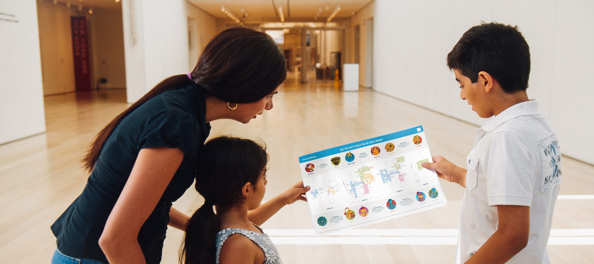
JourneyMaker is a hybrid digital-physical experience in which families create their own themed path through the galleries.
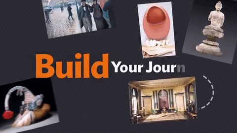
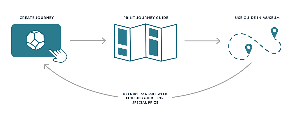
Starting out in the Ryan Learning Center, visitors use an interactive touchscreen to select a story line such as superheroes or time travelers.
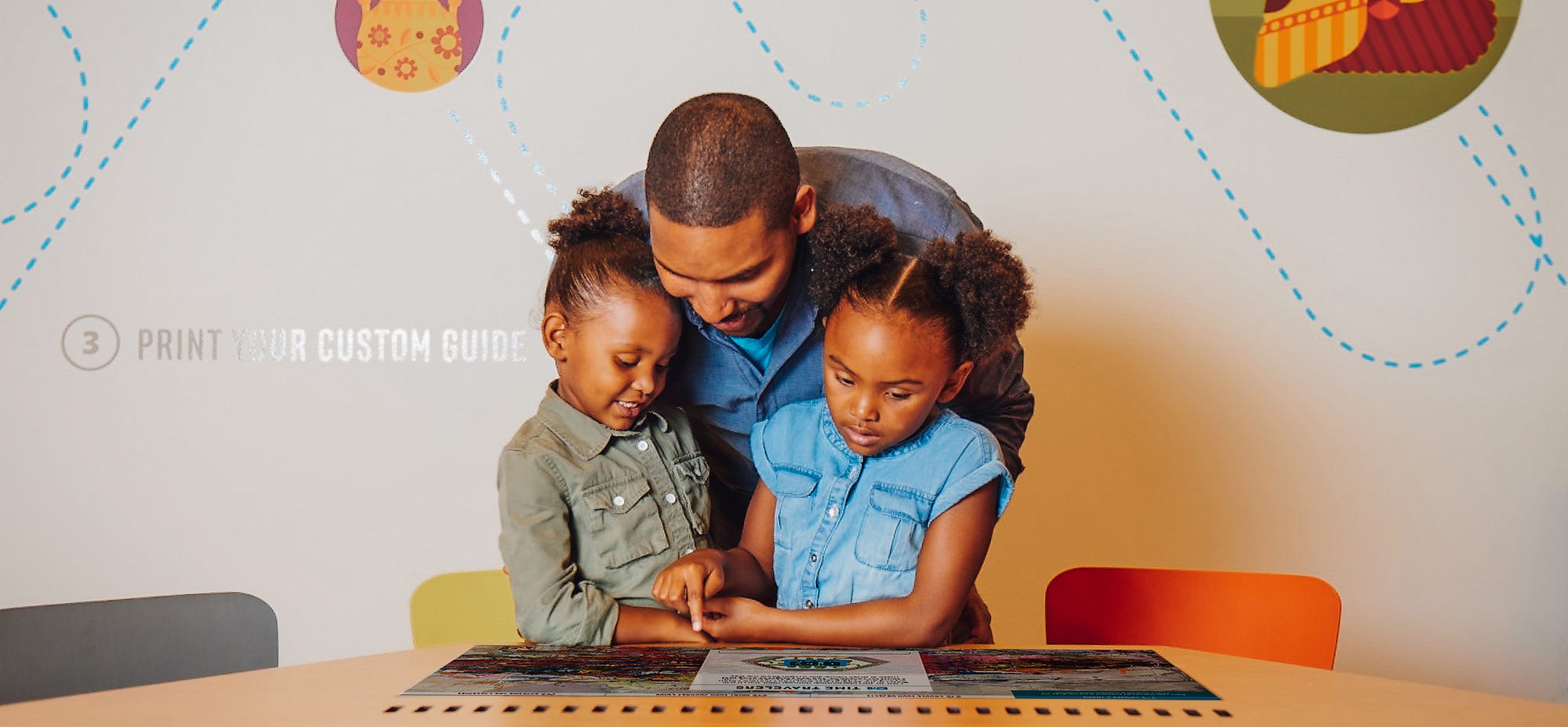
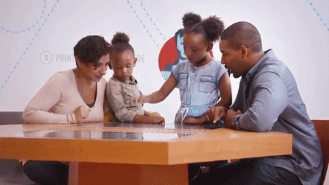
These stories guide the creation of a custom tour culminating in a personalized, printed guide with activities, a museum map, and wayfinding directions to find the artworks selected for the tour.
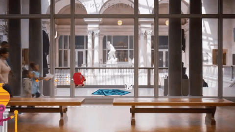
With their custom Journey Guide in hand, families set off on an activity-filled, imagination-sparking adventure through the museum.
The visitor experience starts digitally with a roll of a 12-sided die, and a friendly, one-eyed, furry blue monster, and continues with a printed, origami-style folding guide that magically knows your name. Hardly the standard fare for a digital-borne concept, the process and inspiration for this project was rooted in the world of analog media, tangible creativity, and a museum full of original artwork. For a project that would later become known as JourneyMaker, we started out our process like any good icebreaker — with games and without a clear sense of where our own journey would lead.
Over the course of 18 months, a collaborative group at the Art Institute of Chicago set out to tackle a few big challenges faced by the museum. With our partners in Museum Education, led by Robin Schnur, my team in the Digital Experience department, and our design partners, Belle & Wissel out of Seattle, we formed an interdisciplinary group to solve an interdisciplinary problem.
A challenge that many fine art museums face is one that comes from a preconception of the objects that hang on their walls. Museums—art museums in particular—have a reputation for being dense and inaccessible and by extension, not family friendly. One of our central (and ambitious) goals was to see if we could change the very perception of what an art museum could offer. The path to solving the issue involved a working hypothesis: Could we use imaginative storytelling and participatory activities to connect families with fine art? Could we use these devices to sneak in learning about context, culture, and creativity? And finally, could it (gasp) actually be fun?
Before our core team started in earnest, the project had acquired the name of the “family app.” However, we found that it was misleading to label the project with a technical solution before arriving at a concept. Rather than assume the form factor of an app, we renamed the project and worked to define the goals that would later inform the interactive. Newly minted with the working title of “family-focused digital engagement” (FFDE), the project moved into production. (Yes, FFDE is a yawn-inducing title, but it better explained the backbone of the idea, rather than focus on the technology.)
Our process was a homegrown hybrid of human-centered design, experience design, and museum pedagogy. Rather than diving immediately into production, we first moved through a rapid discovery period. After coming up with three main concepts, the group broke up into separate teams to independently develop ideas. During this time, we created low-fidelity prototypes using simple tools like Keynote.
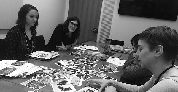
At the end of this phase, we reconvened and pitched ideas back to the group. The winning idea, it was agreed, was the one that most successfully brought visitors into the galleries. The discovery period also helped us define some of the requisite structure, like scope and schedule, that would keep our project on the rails during production.
During the early phases of the project, we stained our fingers with prismacolor markers and sustained the minor wounds associated with the excessive use of post-it notes. With an experience that would bridge the physical and the virtual, it was critical that we map out the idea before ever moving into the (expensive) world of development.
One of the crucial visuals that we created was a simple set of storyboards. In parallel, we had created a sequence of wireframes, but — as much as I love boxes and arrows — black-and-white schematics aren’t great at communicating a spatially oriented idea. Storyboards helped the team imagine the step-by-step interaction as people moved from the learning center to the galleries and then back to headquarters. Wireframes are useful tools, but storyboards kept the entire team focused on the visitor experience.
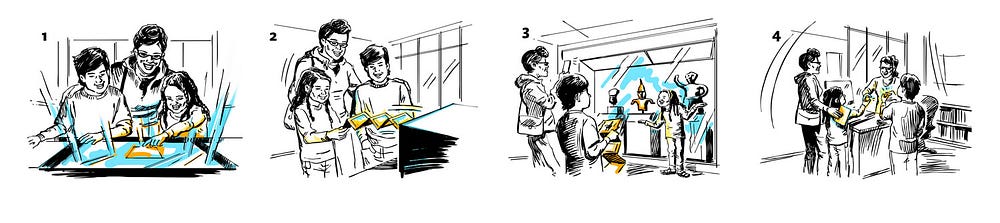
There are many entry points into a work of art. Considering our audience, we followed a narrative path that would appeal to young people. Rather than using chronology, geographical context, or movement (common organizing concepts in museums), we used fictional storylines to propel the narrative. With options like superheroes, overnight adventures, monsters, and time travel, JourneyMaker offers a variety of themes that young people can immediately recognize. These themes help organize the overall museum visit, prompting visitors to choose artworks based on five fun questions. There are literally thousands and thousands of possible combinations that visitors can make for their journey around the museum — 262,000 to be exact.